Archive for Feb, 2015

Player Avatar Design

Posted: 26 Feb, 2015 in Okategoriserade
Tags:

Another week has passed, and it’s time to write down the current process of building up a game, piece by piece. And what is the game my team and I are working on? For starters, it’s called “The Fancy Mansion Heist” (working title) and it’s about a burglar breaking into the luxurious home of Mr. Otto von Fancy. There’s an accomplice waiting for the burglar outside the mansion as well, but they are never seen within the actual game, only communicated with via the use of a mobile phone.

For the past few weeks I’ve focused mostly on the player avatar, the burglar, as they are the prime focus of the game. But what I’ve forgotten to mention so far in my blog posts is my thoughts and process behind designing the look for them.

burglarconcept

This is the concept artwork of the player avatar from the group who made the Fancy Mansion concept, team 15. They described the burglar as a modern and gender-less individual, so anyone would be able to identify with the character. This was something I wanted to keep while designing our version of the game, yet I knew I also had to make the look a lot simpler to make animating them doable. So I proceeded to sit down and draw out what I thought could be a good design.

fancymanskoncep2

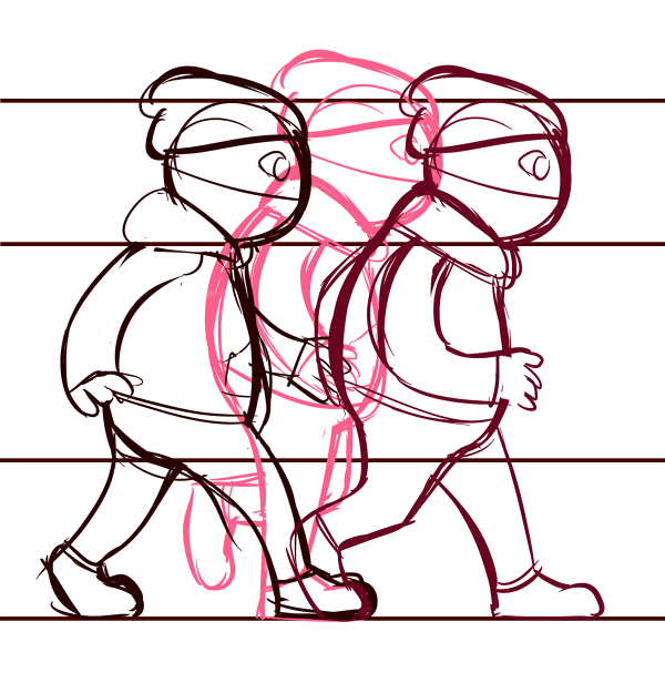
I kept things as simple as possible, with few lines and some edits to the design, clothes-wise and colour-wise. At first I had an idea how perhaps the burglar’s mask was just a piece of cloth tied over their lower face and with a hat on, but this idea didn’t go over so well with the rest of my team, saying that it makes for an odd head shape. The eyes also struck them as not the best idea, so all this was changed in later designs.

1

This is from a test animation where I had only changed the eyes and made the shoes all black (a detail we decided to keep), but where the mask was as of yet unchanged. In the end, I decided to go back to the concept design of the burglar, and use the burglar mask as it was, albeit simplified and all black.

1

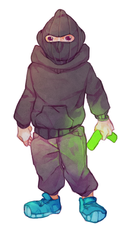
This is another still image from a separate animation, where a simpler mask design had been implemented and the colours were brightened up a bit, after further input from my team members and other people. As I’m responsible for animating both the player avatar and the antagonist, I’ve had to figure out shortcuts to lessen the time spent working on each animation required. Which is why I opted for simple forms with even lines this time, to make copypasting easy and quick. The lines I used were too thin, however, and the colours looks too plain against the in-game enviroments. So for the next step I’ll have to thicken the lines and include some simple shading on the character, to make it fit in with everything else better. I will also re-think the torso piece of the burglar, as I feel it might have gone too far away from the originally intended gender neutral design I wished to keep.

More of this will be discussed in next week’s post! See you then.

/Addis


Work on building a game is progressing, and last week I wrote about the test animation I did for the player avatar. Now, before I go into detail about my process while doing the first attempt at a proper animation, let’s do a quick run-through of what the game is really about.

My group, also known as Team 1, are working on the game “The Fancy Mansion Heist” (working title), which is about a burglar breaking into the luxurious mansion of Mr. Otto von Fancy. The burglar is a scruffy hoodlum of indeterminate gender, and Otto is a wealthy elderly man who is trying to stop you from stealing his valuables.

As I’m the one responsible for animating both the burglar and Otto von Fancy, I have had to try ways to shorten the time spent working on every frame of the individual animations. So I decided to try something I personally don’t enjoy, and draw out perfectly even lines for every body part of the burglar on separate layers in my art program of choice, Paint Tool SAI. This was to simplify copy-pasting, which would only require small edits to the limbs for each frame once I had the main parts drawn out. After spending a few hours adapting the different layers to make 14 frame drawings for the right-side walk animation, I had something which looked like this:

tstwlkrght

This .gif shows how the “bare bones” of the animation looks like, so I could see if the lines matched up well enough to proceed to colouring it in. And as I deemed the mistakes small enough to never be noticed in the actual game, where the burglar will be only a fourth as big as this example .gif, I went on to doing a minor edit line-wise and quickly filling in the flat colours. Once this was done, my animation became something which we could put into our game prototype, to test both speed and graphic elements:

walk-right-PA

For this .gif, I chose to slow down the animation speed a bit, to show my group how quickly I expected the burglar to walk in-game. I assembled a sprite sheet with the 14 frames which makes up the animation, and we implemented it into our prototype. Unfortunately, there was an issue I had overlooked in my process. The burglar did neither stand out against the environment in the way we have strived for, nor match anything design-wise to the rest of the game:

FMprtscr

At this point, all it creates is a boring and bland spot on the screen. So how will I fix this error? Well, since so far this was the only “finished” animation, there won’t be too many hours lost. I’ve come to the conclusion that I’ll have to redo the lines in a manner I’m more familiar with, which is smooth lines with variation in thickness. I will also add simple shading, to give depth cues and create a less flat look for the burglar among the rest of the mansion objects and environments. I will keep the arms on separate layers, and eventually make individual sprite sheets for those, as the player avatar will be carrying a multitude of objects, and the arms has to be adapted accordingly.

Other than this, I’ve learned more of what my weaknesses and strengths are when it comes to graphics due to working on this particular animation. So even though the hours spent on it turned out to be for nothing, I’ve gained important insight, which will hopefully aid me in the coming weeks of building “The Fancy Mansion Heist”.

/Addis

Test Animation

Posted: 12 Feb, 2015 in Okategoriserade
Tags:

For one of the courses I’m currently studying, my group and I have been assigned to build a 2D game based on another group’s concept. My role in this production is Lead Art; to keep track on all the graphics being made between the three artists. My main task is to animate the player avatar and antagonist, and I started by doing a test animation of the player avatar, since it will be the focal point on the screen and it’s crucial that the animations will move in time with the player’s input commands.

I began by making a quick lineup, consisting of a few key frames:

tst1

The lines were not cleaned up, since this animation was only for functionality, not looks. Once I had the first frames done, I began sketching out “inbetween” frames, also known as “tween” frames, to smooth out the movement. I repeated this process, copy-pasting previously drawn frames and editing them to save time, until I had 14 frames in total and a complete walk cycle. At that point, I began to fill in the sketches with colours, keeping them flat and simple, but covering all the parts of the player avatar. This to see how the avatar’s colours would compare to the colours of our prototype level design. Once that was done, I compiled them onto one page, a so called sprite sheet:

sprtchtt

And lastly, I combined each frame into one .gif, to see how well they worked together:

wlkccl

There is a bump in the step I missed as I lined up each sketch over the previous one while building the animation, and the arm movement is not as smooth as I would have hoped for. But due to doing this while I still had time to test things out, I learned what to watch out for before I continue to work on the final animations. And by putting the animation into our prototype game level, It was easy to see that the colours needs to be edited, to avoid making the player avatar be nothing but a bleak blue-grey spot on the screen, as seen here:

FancyMansion_printscreen_1b

Since testing this, the colours have been adjusted on both the player avatar and the surrounding environment, to make the few light spots on the screen be more visible in the darkness that most of the screen will be covered with during the entirety of the game.

To sum things up: The six to seven hours I spent sketching out and editing this test animation in Paint Tool SAI and Photoshop was time well spent, as it proved to be both the learning experience and useful tool it was created for.

/Addis